I’ve been thinking about the history view in Piggy. I came up with some mockups, with these two priorities in mind: simplicity and beauty. I really want the view to look elegant, and I especially don’t want it to look bloated. That’s the point of Piggy: Making expense tracking accessible.
The first mockup I came up with was this:
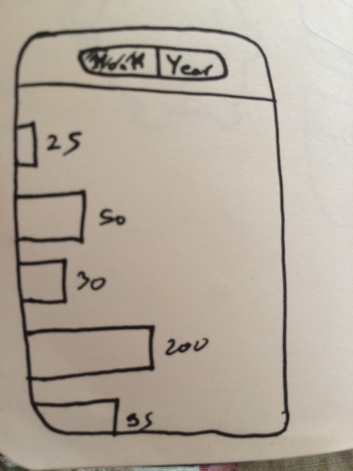
It seemed like a pretty simple concept. You can view the amount of expenses in the past 30 days, or the past 12 months. The problem was twofold: First, it wasn’t really visually pleasing. While the bars might help visualize how much you’re spending by day, it doesn’t do it in a pleasurable way. Secondly, the UI seems functionally lacking. If I spent the most on May 7th this month, what does that really tell me. It’s not important information.
I then iterated on the mockup:
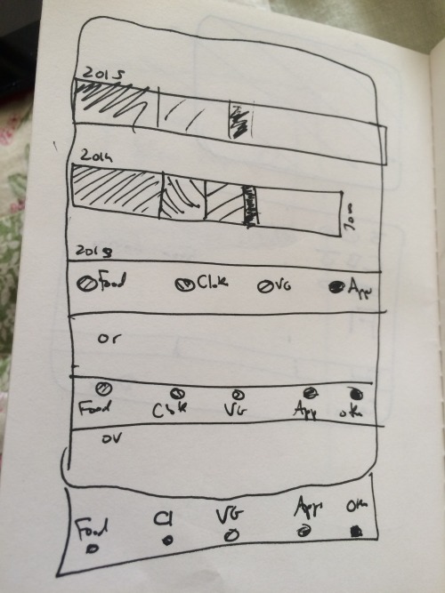
Here, the view turned into more of a hierarchy. First, you see your expenses by year, selecting each year expands into that years’ months, then into days, and finally into the details of each day. Also, the bar for each cell is divided into colored blocks, each representing the top categories of expenses. Swiping on the cell reveals the legend so you know what category each color represents. While the concept seems like a good idea here, it feels too cluttered. There’s a lot going on, it’s a little confusing, and again, doesn’t really seem like it could look that good.
After that I quickly (obviously) sketched out a new mockup:
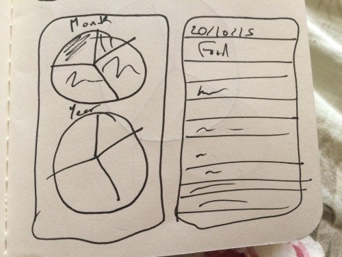
The idea here was that the history view would be separated into two sections. One section would show two pie charts, each representing the most payed-for categories in the past month/year respectively. The second would basically be a list of expenses, sorted by date. I love pie charts, and they feel in place for this kind of app. The idea of this mockup, however, I don’t really like. The pie chart view and the list seem disconnected.
The final mockup I made was this:
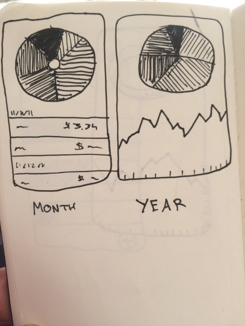
Here, again there are two views for history, but they make more sense. One is for the month, the other for the year. I realized that each of these has different needs. For both, you’d want to know where most of the money goes. The difference is how detailed you’d want the expenses information to be. You’re more likely to want to know what you spent exactly on that day last week that what you spent on some day last year. So, in the month view, you get the pie chart, along with a simple list of expenses by date in that month. And in the year view, you get the pie chart and a graph that shows the amount of expenses by month. This makes sense to me. Also, the UI has the potential to be visually compelling to the user.
It’s probably what I’m going to go for. We’ll see.